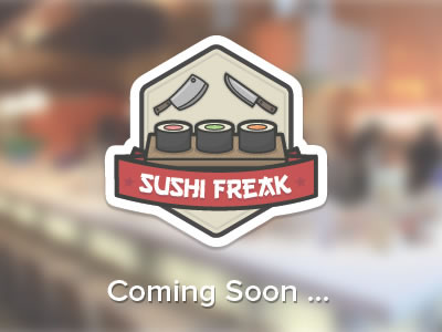
Coming soon pages are a rather young concept on the internet. Back in the day, when a new business was planning to launch a website, one day there was no website, and the next day the thing was live … just like that with no warning.
Nowadays, marketing works a little differently. Everything needs to build up a sufficient amount of buzz, virality, and other new-English words before it can see the daylight. And this is where coming soon pages come into play.
We will take a closer look at the construction of a coming soon page and list some of its most important elements from the designer’s and marketer’s point of view.
“The intangible element”
Sorry for starting this list a little vague, but I consider this the most important element of them all. And what I mean by the intangible element is simply:
The Wow! Effect
In my opinion, a coming soon page has no business cluttering the web if it doesn’t have any wow! effect working for it.
If you can’t give your coming soon page design any wow! then you shouldn’t publish it at all. The whole point of a coming soon page is to get people interested in what’s coming, not to bore them to death.
Of course, the most difficult part here is that this wow! effect is very difficult to define. I have absolutely no idea how to write a tutorial on finding it. I guess that it all comes down to the overall feel of the design. It’s simply something that is or isn’t visible at the end of the day once the work has been done…
Countdown timers
Personally, I like the idea of a countdown timer. It’s simple, easy-to-grasp, there are tens of plugins and scripts available providing such functionality, and it’s perfectly understandable for the visitor.
However, it makes launching the final site a bit more difficult. If you have a timer then you absolutely have to launch the site when the timer displays zero. There can be no delay, or the whole point of a timer loses its meaning.
Email lists / newsletters
Newsletters and email lists are one of the best performing marketing methods online. It’s almost strange that email marketing works that well in every market imaginable.
The simple fact is that people still use email as their main mean of communication online. Even despite the amount of spam that’s circulating around.
In my opinion, placing an email newsletter signup form on a coming soon page is one of the best things you can do. Period.
If you’ve managed to arouse enough interest in the product/site then at least some percentage of your visitors should be interested in getting timely updates about it.
Also, you can then use the list to announce the launch the minute it happens. This will bring you an additional stream of visitors right from the get-go.
And finally, email newsletters are a lot easier to promote than blank coming soon pages.
Say what’s coming
Since it is a coming soon page then there has to be something coming, right? And I’m not trying to be Captain Obvious here. I just want to point out that there are way too many sites on the internet that try to convince me to subscribe to a notification newsletter without even telling me what’s coming.
Rule #1: If you want people to anticipate what’s coming, you have to tell them what it is. Focus on creating curiosity. Share the interesting stuff, not the boring features.
Don’t give away too much information though. If you do, people will get the impression that they know everything, so they no longer have to anticipate anything. You must find the right balance between curiosity and information … something you have to figure out on your own.
This should also be reflected in the design. Boring designs have no place among coming soon pages (going back to the wow! effect).
The easiest way to make your design interesting-description-friendly as opposed to boring-description-friendly is to use rather big-sized fonts. If there’s only place for a limited lines of text then it forces the website owner to provide only the essential information.
Pre-launch bonuses and discounts
Depending on the thing that’s coming, offering some pre-launch bonuses or discounts can make sense. Especially if it’s a new tool, service, or traditional product.
You can offer a discount to everyone who subscribes to your newsletter. You’re killing two birds with one stone here. Apart from the fact that you get people to sign up to your newsletter, you’re also giving them a great reason to visit the site once it’s live.
Of course, you have to make sure that the site can still remain profitable in spite of the discounts. This is something you have to discuss with your client, and make sure that there’s place for discounts in their marketing strategy.
Use the main branding elements
This is basic, and I’m only mentioning it to make the message complete.
I know that no one will probably forget about using the site’s logo if it’s available. But you also have to remember about the color scheme and other small branding elements that will keep the coming soon page and the final website in congruence.
Keep SEO in mind
I know that a coming soon page is bound to have a short lifespan, but you should still have SEO in mind during the creation process.
Remember to use proper tags, page titles, and descriptions. If there’s a promotional campaign prepared for the site (e.g. guest posting, or some link building campaigns) then making the coming soon page SEO-friendly will surely help the marketing efforts.
Besides, this isn’t even about going to the top of search engines with a coming soon page. This is more about not getting the domain itself flagged/banned before the final site even sees the daylight (something many people forget about).
How about a blog?
The main coming soon page is one thing. But a blog that goes along with it can make the whole site a lot more attractive.
Let’s face it, there are very few reasons why a visitor would want to come back to a coming soon page. There are, however, many reasons why they would want to come back to a blog.
Of course, this is a lot more work, but if you’re working on a coming soon page for a medium- or big company then you can point out such a possibility.
Have it easy, use a special theme
Nowadays, WordPress is among the most popular website management platforms available. What this results in is a big number of themes (free and paid ones) meant to achieve tens of different things. Not surprisingly, there’s also a fair share of coming soon themes.
Even if you don’t want to use any part of the design offered by a given theme, you can probably still use the framework. Such themes often provide quite a nice set of features that will make your work way easier.
Just give it a shot, there’s not much you can lose by testing such a theme quickly.
That’s it for my list of elements of a proper coming soon page. Feel free to comment, tell me what you think, and point out some other elements you find suitable for such a page.


