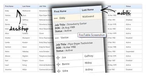
There are many ways to serve each web element in responsive layouts. For HTML tables, FooTable (a jQuery plugin) comes with a great approach without breaking the functionality and design.
The plugin auto-hides the selected columns on each breakpoint defined and users won’t need to scroll horizontally.

What makes it better is that “the hidden columns can be viewed by simply clicking each row” so that it is still possible to navigate through the complete data.
It is applied very easily with the help of data-attributes and the plugin leaves an open gate for future enhancements as there is a plugin framework within.
Demos
- Responsive showcase – this houses all the demo’s so far with an easy to use viewport switcher to demo the features will minimal effort!
- Simple table with text
- Table which includes images and links
- Sorting demo
Download
Get the source from Github, or you can download it direct.