Using responsive CSS frameworks developers can speed up the delivery and improve the quality of responsive CSS code. Since responsive web design is in high demand a lot of frameworks have been created to streamline the delivery of high quality mobile-ready websites. These resources can make it easier for you to create responsive websites and in combination with a framework for HTML, like e.g. HTML5 Boilerplate you will have a really strong foundation.
In this article we present some of the most popular and useful responsive CSS frameworks. This can help you to get started and to keep focus on what is important, such as layout, usability and content. Please tell us your opinion, questions and thoughts in the comments, and help us by sharing this post to your friends.
Less+ Framework
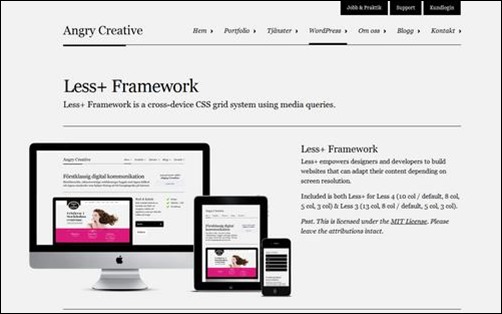
Less+ Framework is a cross-device CSS grid system using media queries. This framework is an extension of the Less Framework built by Joni Korpi with the difference that it has extended support for Internet Explorer. This branch of the Less Framework uses the Jquery Media Queries library built by Protofunc as suggested by Richard Shepherd.
Foundation 3
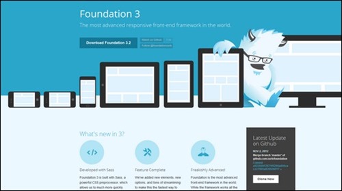
Foundation 3 is one of the most advanced and feature rich CSS frameworks for building responsive websites. It is built with Sass, a powerful CSS preprocessor. This gives you the tools needed to quickly customize and build on top of Foundation. It also comes with a Add-on concept where you can find more templates, responsive tables etc. to get things done even faster.
Titan Framework
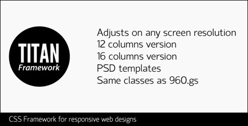
With Titan Framework you can create responsive layouts that adjust to any screen resolution at maximum width. The framework uses the same CSS classes as 960.gs so if you are familiar with this it may be an advantage for you. It should also make it simpler to make existing 960.gs based websites responsive.
Skeleton
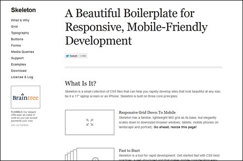
Skeleton is a small collection of CSS & JS files and a CSS framework with a lightweight 960 grid that seamlessly scales down to downsized browser windows, tablets, mobile phones. This works well in both landscape and portrait. You will find that it use a organized file structure and offer the most needed basic UI elements like lightly styled forms, buttons, tabs and more.
Responsive Aeon
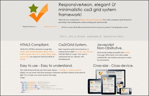
Responsive Aeon is a responsive grid CSS based framework all based on percentage with media-queries, html5 starting point and javascript. It is a basic responsive grid system based on 12 columns layout. Responsive Aeon is clean and simple making it great for setting up mockups fast, but it will also work for full website development.
Responsive Grid System
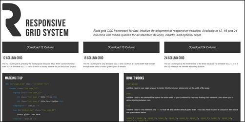
Fluid grid CSS framework for fast, intuitive development of responsive websites. Available in 12, 16 and 24 columns with media queries for all standard devices, clearfix, and optional reset.
Gumby 960 Grid Responsive CSS Framework
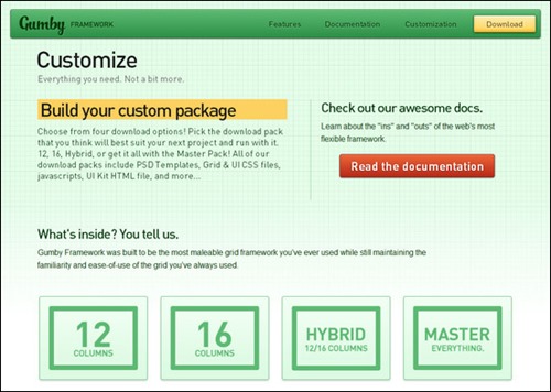
Gumby allows you to build your own custom package and either download a 12 column version, 16 column version, hybrid 12/16 column version or the full framework in a single bundle.
As part of the framework the developer have packaged up several styles and commonly used interface elements (forms, buttons, tabs, and pure CSS dropdowns). This will help you get started quickly and allow you to add responsive capabilities with minimal CSS coding.
Ingrid

Ingrid is a lightweight and fluid CSS layout system, whose main goal is to reduce the use of classes on individual units. Making it feel a bit less obtrusive and bit more fun to re-flow for responsive layouts. Ingrid is also meant to be an extendable system, easy to customize to your own needs.
320 and Up
320 and up will work as an extension to HTML5 Boilerplate or a set of standalone files. It offers five CSS3 Media Query increments: 480, 600, 768, 992 and 1382px to fit most browsing needs. It rely on Bootstrap styles for buttons, forms and tables.
Gridiculous – A Fully Responsive Grid Boilerplate
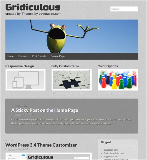
Gridiculous is a responsive HTML5 Boilerplate based framework using a twelve column grid. It starts off at 1200px and works itself down to 320px
Gridiculous is also available for WordPress and this is great news for WordPress theme developers. You see, responsive WordPress themes are selling as fresh baked bread.